What menus tell us about dining in America
Restaurant menus can be surprisingly revealing. Sure, they’ll tell you what you can order at the hottest restaurant in your city on a particular evening. But they’re also a time capsule of culture, reflecting the comforts, habits, flavors and values of an era.
That’s been true since the first American menus of the 1840s, which cataloged the opulent dishes at hotels catering to the ultrawealthy. And it remains so, well into the age of QR-code fatigue.
Last year, as the New York Times Food team traveled the country to scout candidates for our annual list of favorite restaurants, we also set out to understand, more broadly, what defines eating out today.
After years of plexiglass dividers, curbside delivery, masked servers and, yes, QR codes, one thing was immediately clear: Physical menus aren’t just back. They have more personality than ever.
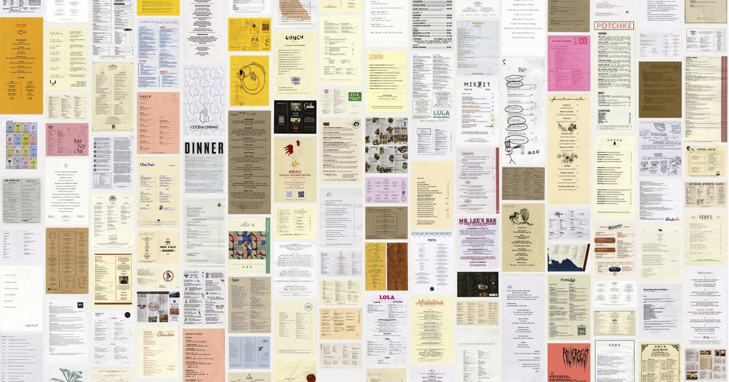
We visited hundreds of restaurants of varying styles, cuisines and price points — and left with 121 menus in hand. Together, they provide a snapshot of the distinctive new shape of dining right now.
THE FOOD
Trendy offerings like tinned fish and $12 bowls of olives show no signs of disappearing, but some dishes and ingredients feel especially of the moment.
Hail, Caesar!: The Caesar salad isn’t just a steakhouse fixture. You’ll find it at Mexican restaurants. And Thai restaurants. And Cuban restaurants.
Some have miso or fish sauce in the dressing, while others are sprinkled with fennel pollen or replace romaine with snow peas.
And you’ll pay for those flourishes. The average price for a Caesar on these menus was $15.42, with the most expensive one clocking in at $22.
“It’s a lot of chefs’ favorite salad to eat,” said Fermin Nuñez, who serves a Caesar del Jardín at Este, his coastal Mexican restaurant in Austin, Texas.
Want caviar with that?: Diners, many of whom grew accustomed to empty grocery-store shelves during the pandemic, crave maximalism and opulence, said Anna Polonsky, the founder of Polonsky and Friends, a design studio in Brooklyn. “It’s true with presentations as well: croquembouche, towers, big scoops of ice cream.”
To appeal to that appetite, restaurants of all kinds are offering caviar in every way you could imagine. In 2023, you could even get it inside a quesadilla.
And the flavor-of-the-year award goes to: Yuzu is inescapable, but the citrus fruit is being treated with the nuance it deserves. Its delightfully tart and floral flavors grace not only cocktail menus, but also crudos, pickles and vinaigrettes. Chefs can’t seem to get enough of yuzu kosho, a chile-based condiment made with the peels.
The New York Times gathered 121 menus from restaurants all over the country. Together, they offer a glimpse into the tastes and values of today. (Tony Cenicola/The New York Times)
Why did the chicken cross the globe?: It’s boom time for fried chicken at restaurants of practically every style and cuisine: chai-brined crispy chicken at an all-day cafe, chicken milanesa tortas at a Mexican restaurant, chicken katsu at an izakaya. As menu prices continue to rise, the tantalizingly crunchy dish is often one of the more inexpensive entrees — and a familiar comfort food to diners of all stripes.
Dessert, just like Mom used to make: Your childhood called, and it wants to know whether you want Funfetti or instant pudding to end your meal. Sweets like sundaes, arroz con leche, soft serve and butterscotch pie are dominating dessert menus, often labeled “Mom’s” to lend them extra credibility.
Panna cotta prevails: Even as the cost of eggs skyrocketed, restaurants continued to rely on a dessert standby: panna cotta. The bouncy custard can be made in advance and doesn’t require a pastry chef to execute, as many restaurants dropped their pastry departments during the pandemic.
THE AESTHETIC
Like purses, menus have shrunk. Many restaurants favor a vertical, half-page menu — just the right size for holding in your hands, with no pages to flip through and, often, fewer items to choose from.
But beyond that stricture, anything goes. “There is a lot more openness to be unique in their brand and not look like what everyone else is doing,” said Lisa Peteet, a founder of the design agency Atlas Branding in Asheville, North Carolina, who creates menus for restaurants across the country. “As a designer, we felt more liberated being able to suggest ideas that we wouldn’t suggest” a few years ago.
In an image provided to the New York Times, A menu for Phuket Cafe, Portland, Ore., part of a trend away from white and off-white to bright colors. The New York Times gathered 121 menus from restaurants all over the country. Together, they offer a glimpse into the tastes and values of today. (Via The New York Times)
Bolder and brighter: While white and off-white have long felt like the default menu colors, some restaurants are setting themselves apart by adding pops of neon and bright patterns. Dazzling pinks made a noticeable splash in the year of Barbie supremacy.
Claire Dufournier, the art director of Polonsky and Friends, said colored paper has become a popular way to strike a contrast with the tablecloth and the rest of the dining room. “It is part of the interior design,” she said.
In an image provided to the New York Times, The menu at Tatemo in Houston, an example of a trend toward tiny, tiny fonts. The New York Times gathered 121 menus from restaurants all over the country. Together, they offer a glimpse into the tastes and values of today. (Via The New York Times)
Honey, they shrunk the fonts!: What is this, a restaurant for ants? Consider this a formal plea to increase font sizes so we don’t need a magnifying glass to find out what’s inside the cemitas. Some menus, like those at Pijja Palace in Los Angeles and Tatemó in Houston, had fonts as small as 5 points. (By comparison, the New York Times is printed in 8.7-point Imperial Regular font, though we sometimes go down to 8 points.)
Cute mascots to root for: Cutouts, abstract shapes and line drawings inspired by artists like Henri Matisse and Jean Cocteau pop up all over these menus. But many restaurants have gone beyond simple illustrations, representing themselves with a mascot, usually an adorable animal or food item.
Like fashion labels, “restaurants have become brands,” Polonsky said. “People are tired of having logos everywhere, but having an icon is a way to be distinctive but not too obvious.”
Informal is in: Cheesy fonts, wonky formatting, basic printer paper, a slightly messier look: Some menus look as if they were created by a design-school freshman. And that’s the point.
“It is intentionally done where it feels less formal and way more approachable,” said Badal Patel, a designer in Los Angeles. Making menus that don’t look pristine, she added, conveys “more of a humanness.”
The humanity’s in the details: Another way restaurants remind us of the people behind them: subtle, analog touches like stamps, wax seals, handwriting or embossing.
Blind embossing, in which the restaurant’s name is pressed into the paper with no ink, “is huge these days,” said Dufournier, and the choice conveys an attention to details.
THE ANATOMY
In structuring menus, many restaurants have strayed from a traditional course-by-course layout in favor of fresher and more expansive sections and formats. They’re also trying to better communicate their values. If the farm-to-table movement inspired menus that listed every local supplier, this era’s emphasis on workers’ rights has spurred owners to credit every employee or note that they provide health insurance.
The mission statement pivots to labor: Many restaurateurs are using limited menu real estate to signal their commitment to staff, and service charges that go toward higher wages or employee benefits are among the most popular ways to do so. These fees — and the sometimes lengthy explanations that accompany them — show up on nearly one in five of our menus.
Some menus go a step further, listing not just an executive chef but the entire staff, and in some cases, their preferred gender pronouns.
‘Small, big, bigger’ is the new ‘appetizer, entree, dessert’: Size-based categories are a major departure from the sprawling list of small plates popular on menus in recent years. It’s a format that allows diners the flexibility to order only with themselves in mind or to share a variety of dishes.
Hold the booze: As more Americans take a break from alcohol — whether forever or just for a month — restaurants have responded by dedicating whole sections to buzz-free options. They can include a variety of teas, freshly pressed juices or virgin cocktails that taste just as complex — and cost just as much — as their alcoholic cousins. And “zero proof” is the new “mocktail.”
What’s in a dish?: Somewhere between the elaborate dish descriptions of the 1990s and the single-ingredient titles of the 2000s (“Scallop. Shiso. Lemon.”), many restaurateurs have found a happy medium: just enough information to convey what a dish might actually look or taste like, with a little mystery to keep the diner in suspense.
Some menus we just couldn’t take home: Like the ubiquitous menu board. More formal than a chalkboard and more inviting than a mounted digital menu, this minimalist black-and-white letter board can be found in bakeries, burger joints and all-day cafes.
“I grew up in the ’90s and admired the old-school menu look at restaurants,” said Abbas Dhanani, the owner of Burger Bodega in Houston. He set out to imitate them, “but add a creative, modern twist.”
No matter which restaurant they came from, these menus exude a warmth and enthusiasm for dining out. Some even made us laugh.
Like the menu at Street to Kitchen, a Thai restaurant in Houston, that doubles as a three-act play.
Because what’s dinner without a show?
Related Articles
Smorgie’s, focusing on affordable comfort food, opens across from Xcel Energy Center
Downtown St. Paul real estate mogul Jim Crockarell dies at 79
Stillwater’s ‘Best Wings’ contest, benefit begins
Need more veggies? Go ahead and double the greens in these recipes
Owamni’s ticketed tasting menu is worth the splurge

